


Paper of Time - Watch Face
4.136.00 Reviews
App Specs
- Version
- Varies with Device
- Updated On
- License
- $1.99
- Downloads
- 10,000+
- Developer
- EK Watch Faces™
- Categories
- Personalization
- Platform
- Android
Screenshots
 Analysis by AppCompare
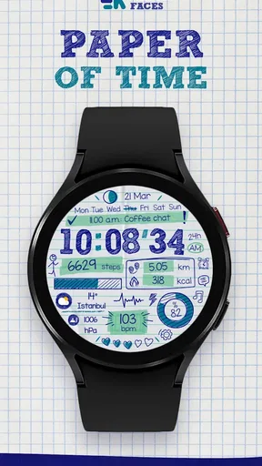
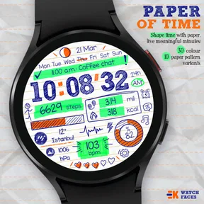
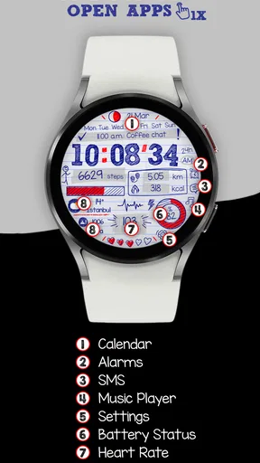
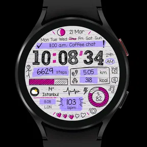
I rarely think about a watch face as something worth reviewing in depth, but Paper of Time - Watch Face changed that reaction for me. It treats the watch screen less like a dashboard packed with information and more like a small piece of visual design. The idea is simple: time is presented with a paper-inspired look, while the passing minutes become part of the face’s character rather than just another digital readout.
That makes it a particularly interesting choice in the personalization category. I see it as a watch-face app for someone who wants a calmer, more distinctive screen on a compatible smartwatch, not for someone who wants every possible shortcut, statistic, or notification visible at once. My experience with it is best summed up this way: it gives the watch a point of view. The trade-off is that a point of view usually means fewer compromises in favor of maximum information.
Developed by EK Watch Faces™, the app costs $1.99 and is rated for Everyone. Its current store presence is modest but encouraging, with a 4.1 average from around 248 ratings and more than 10K installs. Those figures suggest that it has found a real audience without pretending to be a universal replacement for every watch face. The app was released on March 6, 2024, so I approach it as a relatively young design whose identity is already clear, while its longer-term evolution is still something to watch.
How the paper-inspired design feels in everyday use
The strongest part of the experience is the visual concept. Instead of copying the glossy, technical appearance common to many smartwatch faces, Paper of Time leans into the feeling of a printed page or crafted paper object. That changes how I read the screen. I do not glance at it expecting a wall of metrics; I glance at it because the face itself feels more intentional and less noisy.
That distinction matters during ordinary moments. When I check the time while making coffee, walking between meetings, or waiting for a bus, I want the answer quickly, but I do not always want a miniature control panel demanding attention. This face works well in that kind of situation because its appeal comes from restraint. It makes the watch feel more personal without turning it into another source of visual clutter.
The phrase “live meaningful minutes” also points to the central mood of the design. The passage of time is not treated as a sterile sequence of digits. Instead, the face aims to make the minute hand or minute display feel visually meaningful. I found that approach more memorable than a standard stock face, especially after using it for several days and becoming familiar with its rhythm.
There is a useful psychological trade-off here. A highly detailed face tells me more, but it can also encourage constant checking. A quieter face gives me less context, yet it makes the glance feel more deliberate. Paper of Time belongs firmly in the second group. If you like the idea of a watch that looks like an object with character rather than a tiny phone screen, this is where the app earns its place.
Worth Reading Before You Choose
EA SPORTS FC Mobile 26 Is a Bigger Football Game, but It Takes Time
Flipboard Shows What News Apps Must Do Beyond the Feed
Switching to Android Auto Means Rethinking Your Driving Routine
Google Calendar Makes a Crowded Week Easier to Manage
Ludo King Makes the Most of the Minutes Between Plans

Baby Panda World Brings Quick Play to Modern Phones, but Its Game Library Feels Busy
Who will get the most from it
I would recommend it first to people who choose watch faces for atmosphere, not just utility. It suits a minimalist wardrobe, a desk setup built around stationery and physical notebooks, or anyone who finds the usual neon-heavy smartwatch styles too aggressive. It can also work nicely for users who want their watch to feel less sporty during work or social occasions.
It is especially appealing if your current face feels visually exhausting. Many alternatives compete by adding complications, rings, graphs, weather panels, health summaries, and app shortcuts. Those faces can be excellent, but they ask the eye to process a lot. Paper of Time takes the opposite route. Its value is not that it replaces all those tools; its value is that it lets the watch become quiet again.
I would be more cautious about recommending it to someone who uses the watch primarily for training, travel, or fast access to several live details. If your normal glance needs weather, battery, appointments, activity progress, and other information together, a data-focused face will probably be more practical. Choosing this design means accepting that visual identity comes before information density.
A realistic daily scenario
Imagine starting the day with the watch on your wrist while your phone remains in another room. You glance down to check whether you have enough time before leaving, then look again later while standing in an elevator. With a conventional information-heavy face, each glance may pull you toward another metric or alert. With Paper of Time, the interaction feels more contained: check the time, absorb the visual treatment, and move on.
That is a small difference, but it is the kind of difference that explains why people pay for a watch face when free options are everywhere. I do not see this purchase as buying extra functionality. I see it as buying a particular relationship with the screen. The $1.99 price is easier to justify if that relationship matters to you and harder to justify if you only want the largest possible collection of numbers.
What its early release tells me about the product
Because the app arrived on March 6, 2024, I think it is useful to separate what is already visible from what I would merely hope to see later. The current identity is not vague: the paper concept is the product, not a decorative detail added to an otherwise ordinary digital face. That gives the app a strong starting point, because users can understand its purpose immediately.
At the same time, a newer watch-face release has to prove that its design remains comfortable after the novelty fades. The first impression may be artistic, but long-term success depends on practical questions such as readability in different situations, how naturally the face fits into a daily routine, and whether the design continues to feel useful rather than merely unusual. Those are the areas I would pay attention to as EK Watch Faces™ continues developing it.
The current evidence from its audience is positive enough to take seriously. An average rating of 4.1 is not a claim of perfection, and I prefer that kind of signal to an unrealistically flawless impression. The app has received around 248 ratings and 36 written reviews, which gives potential buyers some community feedback while still indicating a relatively focused user base. More than 10K installs show that it is not an obscure experiment, but it remains a specialized choice rather than a mass-market default.
For existing users, that early stage can be both attractive and slightly uncertain. On the positive side, the face has a clear personality instead of feeling like a generic template. On the other hand, buyers who expect a large ecosystem of options or frequent visible changes may need a different kind of product. I would install it because I like the design direction, not because I expect it to behave like a full watch customization suite.
How it compares with ordinary alternatives
The usual alternatives fall into several familiar groups. Stock watch faces are normally the safest choice for compatibility and quick access to the information the watch manufacturer considers important. Fitness-oriented faces are better when the wrist is mainly a training tool. Minimal digital faces are often easier to read at a glance. Decorative faces may offer more variety, but their visual themes can be interchangeable.
Paper of Time competes on a different axis. Its advantage is coherence. The paper idea gives the screen a recognizable mood, while many generic faces are simply collections of widgets arranged around a clock. If I were choosing between this and a stock face, I would choose the stock option for a long run and this one for a normal workday when I want the watch to look less technical.
It also differs from a purely minimal face. Minimalism alone can mean removing everything except the hour and minute. Here, the paper treatment adds texture and meaning, so the result is not just empty space. That makes it more expressive, but it also means the visual style may be less universally legible than a plain high-contrast digital display.
One practical tip is to judge it while wearing the watch in the situations that matter most to you, rather than deciding from a static preview alone. A face that looks beautiful in an app listing may feel too subtle in bright outdoor light or too decorative when you need an instant time check. I would test it during a normal commute, at a desk, and in the evening before deciding whether its character outweighs any readability compromise.
The trade-offs I noticed before committing
The first trade-off is information density. A paper-inspired face has a visual language that rewards simplicity, so it is not the natural choice for people who want several complications arranged around the clock. If you are constantly checking secondary information, you may find yourself opening other screens more often. That is not necessarily a flaw, but it is a real change in workflow.
The second is attention. The distinctive design can make the watch more enjoyable to look at, yet that also means it may become more noticeable than a plain face. For some users, this is exactly the point. For others, especially those trying to reduce screen stimulation, the best face may be one that disappears into the background. I would choose Paper of Time for calm visual interest, not for total invisibility.
The third is commitment to a theme. Because the paper concept is so central, it may not match every outfit, watch case, or occasion. A neutral stock face is easier to use everywhere. This one makes more sense as a deliberate style choice. I would not expect it to be the only face on my watch; I would keep it available for days when its tone fits better than a sport or productivity layout.
There is also a purchase decision to consider. At $1.99, it is inexpensive compared with many broader software purchases, but it is still paid personalization. That means the design has to appeal to you personally. If you are undecided about paper textures, artistic layouts, or restrained time displays, the cost is not automatically justified simply because the app is affordable. The right question is whether you want this specific visual experience on your wrist.
What I would like to see as it matures
I would watch for improvements that preserve the paper identity rather than turning the app into another crowded dashboard. The most valuable evolution would be refinement: making the time remain effortless to read, keeping the design distinctive, and ensuring that any customization supports the concept instead of diluting it. A paper-themed face does not need to imitate every feature of a technical face to be successful.
For current users, that means the app’s future should be judged by consistency as much as novelty. New visual variations could be welcome, but only if they still feel like part of the same design family. A flood of unrelated styles might increase choice while weakening the reason people selected this face in the first place. I would rather see a smaller, coherent direction than a large menu of themes with no shared character.
For potential buyers, the sensible approach is to decide based on the present experience. The app already has a clear concept, a recognizable developer, an Everyone content rating, and an audience large enough to show genuine interest. I would not buy it on the promise of hypothetical future additions. I would buy it because the current paper-inspired treatment makes me want to look at my watch in a different way.
One workflow I found useful is to treat it as a context-specific face rather than a permanent replacement. Keep a data-rich face for exercise or days packed with appointments, then switch to Paper of Time when you want a calmer visual surface. This approach avoids forcing one design to handle every task. It also makes the app’s limitation—its preference for atmosphere over utility—feel intentional instead of disappointing.
Another useful test is to ask what you actually do during a watch glance. If the answer is usually “read the time and continue,” this face is a strong candidate. If the answer is “check three metrics, open a shortcut, read the weather, and review progress,” it is probably the wrong tool. That simple distinction is more useful than comparing screenshots, because it connects the design to your real behavior.
My recommendation for Paper of Time
Paper of Time - Watch Face is a focused personalization app with a clear artistic idea and a practical limitation: it wants the clock to feel meaningful, not overloaded. I appreciate that focus. In a category full of faces competing to show more, this one is comfortable showing less while giving the screen a warmer identity.
I would recommend it to anyone who values visual calm, paper-inspired design, and a watch face that feels chosen rather than merely installed. It is a good fit for everyday wear, especially when you want to reduce dashboard clutter without making the watch look completely plain. The developer’s early release has already established a recognizable direction, and the current rating of 4.1 suggests that many users find that direction worthwhile.
I would skip it if your priority is maximum data at a glance, sport-specific monitoring, or a large customization system. In those cases, a stock, fitness, or information-heavy alternative will serve you better. Paper of Time is not trying to win that contest, and judging it by those standards misses its purpose.
For me, the app succeeds because it makes a small screen feel considered. The $1.99 purchase makes sense when you want that particular mood on your wrist and are comfortable switching to another face when utility takes priority. Its next stage will be interesting to follow, but the current version already offers a complete enough idea to recommend: a distinctive, paper-like way to check the time without turning every glance into a data review.
Pros
- Elegant paper-inspired design gives the watch a distinctive
- premium appearance.
- Clear time display remains easy to read at a quick glance.
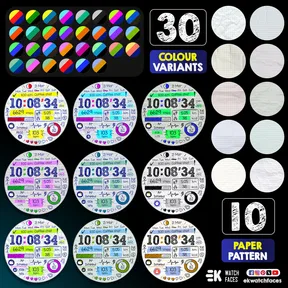
- Customization options help match the face to different watch styles.
- Lightweight layout should have minimal impact on everyday watch performance.
- A good choice for users wanting a less conventional watch face aesthetic.
Cons
- Some design elements may be too subtle for users who prefer bold watch faces.
- Compatibility can vary depending on the Wear OS version and watch model.
- The paper theme may feel less practical for users needing dense information.
- Certain customization features may require additional setup or permissions.
- Limited appeal if you prefer sporty
- digital
- or highly data-focused watch faces.
FAQs for Paper of Time - Watch Face
What is Paper of Time - Watch Face?
Paper of Time - Watch Face is a customizable watch-face application designed to give compatible smartwatches a distinctive paper-inspired appearance. It focuses on presenting the time with a clean, artistic layout rather than a traditional digital clock design. Depending on your device and operating system, it may also include options for colors, complications, date information, or other display elements.
Which smartwatches and phones are compatible with Paper of Time - Watch Face?
Compatibility depends on the version of the app and the smartwatch platform it supports. Before downloading, check the application listing for the required operating system, supported watch models, and phone requirements. Some watch faces are intended for Wear OS devices, while others are made for Apple Watch or specific companion applications, so availability and installation steps can vary between Android and iOS.
How do I install Paper of Time - Watch Face on my smartwatch?
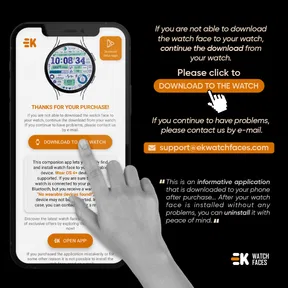
After installing the app or purchasing it through the relevant app store, follow the on-screen instructions to add the watch face to your connected smartwatch. In many cases, installation requires the watch to be paired with your phone and connected to the internet. Once installed, open the watch-face selector on the wearable, choose Paper of Time, and apply it as the current face.
Can Paper of Time - Watch Face be customized?
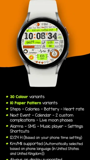
The available customization tools depend on the watch platform and the specific release of Paper of Time. You may be able to adjust colors, layout elements, complications, or information such as the date and battery level. Some options can be changed directly from the watch, while others require the companion phone app. Review the store description carefully to confirm which features are included.
Does Paper of Time - Watch Face affect battery life or require extra permissions?
Like any active smartwatch face, Paper of Time may have a small effect on battery life, especially if it uses animated elements, frequent updates, sensors, or multiple complications. The actual impact depends on your watch and settings. Installation may also request permissions needed for complications or device connectivity. Only grant permissions that match the app’s stated functionality, and check its privacy information before use.


